Abidbhai Marchant (Captain), Mustafa Kamal, Jim Li, Ben Lyons (Analyst), Vijay Peethambaram, Alok Rastogi, Lindsey Schott (Developer), and Kelly H. Zou (Storyteller)
Editor’s Note
The authors on the hackathon team are either employees or contractors of Pfizer Inc. Views and opinions expressed in this article are the authors’ own and do not necessarily reflect those of Pfizer Inc.
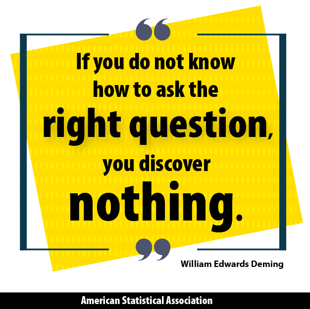
Have you read the article by Brent Dykes titled “Data Storytelling: The Essential Data Science Skill Everyone Needs?” According to Dykes, “Data storytelling is a structured approach for communicating data insights, and it involves a combination of three key elements: data, visuals, and narrative.” For the purpose of data storytelling, it is helpful if you are a “data ninja” who possesses both intelligence (IQ) and emotional intelligence (EQ).
In the fall of 2017, we participated on Team 1—consisting of eight members among five teams—at the annual Tableau hackathon. Each team included approximately 10 participants who were willing to enter the contest in advance.
Prior to the virtual formation of the team, the teammates barely knew each other and their programming levels in Tableau were variable. The hackathon organizers managed to consider leveling the skills across all participating teams.
Kelly Zou, the team’s main storyteller and an analytic science lead at Pfizer Inc., provides advice to fellow data scientists in the era of big data.
Four complex human activity tracking data sets were provided to us one week before the final presentation date. We were asked to complete an interactive Tableau dashboard within a short period of time. The team captain and analyst immediately set out to tackle understanding, making sense of, and analyzing the data before generating an illustrative demonstration for insights.
Our team won in all four areas: storytelling, insights, visual appeal, and innovation. Thus, we would like to share our experience winning a data science hackathon.
Data Parcellation: The Gruesome Pre-Processing Work
The moment when the data sets were assigned felt to us like receiving our SAT or GRE scores. Our hearts pounded loudly and the curiosity was evident. Soon afterward, however, the reality hit us and gave us a sinking feeling. We simultaneously took a peek at the data sets stored in the CSV formats before having a brief team discussion. We realized quickly that there were four complex data sets with no to little information about the source of data generation or the variables. We started to do our homework to gain a better understanding of each data set.
- The “Report” data set recorded various activity types (e.g., eat, walk, car, bus, train, etc.) and the corresponding activity durations and timestamps down to minutes in a period of two weeks.
- The “Smart Phone” data included features (e.g., steps, activity, radio, gravity, pressure, etc.) and timestamps.
- The “Smart Watch” data set included features (e.g., heart rate, acceleration, battery, gravity, magnetometer, gyroscope, etc.) and timestamps.
- The “Glasses” data set recorded high-dimensional value (e.g., acceleration (x,y,z), gyroscope (x,y,z), electrooculograph (l,r,h,v), etc.) and timestamps.
Before we were able to consider a statistical analysis plan, we had to parcellate (split) the text timestamps into variable columns. We assumed a human subject wore a smartphone, smart watch, and glasses to record activities and durations. Since Tableau could not provide an easy way to separate the timestamped mobile data, we decided to use a data parcellation process using both RStudio and raw CSV.
Making Sense of an Abundance of Messy Data Sets
We realized being too broad or too choosy were not the best strategies. Thus, under the main theme of the hackathon, which was “data storytelling,” we assumed the same human subject recorded two weeks of mobile data. We conducted exploratory descriptive analyses to visualize the data in Tableau. It is important to gain experience in this software and tell a succinct and coherent story within 10 minutes of the final presentation. We stayed focused and were realistic from the beginning.
Seeing the Big Picture and Realistic Hypothesis Generation
We liked the “big picture” approach, given the background information we could find on our own. In a word, by 2020, “smartphones will account for two out of every three mobile connections globally.” We set our overarching goals—to understand human behavior, assess how activities affect the human body, help improve health, and leverage future data mining and machine learning—quite high. Perhaps we could discover and build apps that would be valuable to society.
We decided to first describe the human activities overall, and then the top 10 activities during the weekdays vs. the weekend for the human subject. In addition, we queried to identify the factors that could affect the heart rate (HR). We aimed to examine the variation of HR over time. In addition, we hypothesized the relationship between heart rate and other factors, including the step taken and the pressure the smart watch was able to record.
Building Analytic Dashboards with Time Constraints
When the main developer started to quantitatively and visually address these analytic tasks, the team realized each dashboard required painstaking detail. Even the consistent color choices across various panels within the entire delivery would be meaningful to lay audience members who had not seen or lived with the data as we had. Indeed, we strived to marry data and art! Outliers were informative and handled with caution.
Attention to Details vs. Getting Things Done
Realistically, however, we only had one week. Thus, we could not experiment with or obsess over too many variations while aiming to perfect the final product. During the week and weekend before the final presentation, we asked many questions surrounding the goals and approaches. If we hadn’t known something in advance, it was a great opportunity to find out. For example, we studied the variables associated with mobile devices, as well as the literature on time series data generated by mobile sensors. In our mind, we hoped to use such subject-matter knowledge.
Quantitatively, we found the top activities using the analysis of frequencies and found differences in the average activity durations over time. For example, the weekday vs. weekend patterns of activities were different. We found positivity relationships between average step per minute and HR, as well as air pressure and walking speed. Interestingly, there was a gap in the timestamps, as the human subject did not carry his or her devices on July 6.
Postulating the Main Character from Complex Data
A vivid mental picture started to emerge after we lived and breathed data in a detective-like investigation during our spare time. We envisioned a human “techie” who spent much time at home living “in” his or her computer, taking walks, partying, and picnicking. From July 4–6, as well as during mornings, the human had a low level of activity. We thought he or she was likely a US resident perhaps having a BBQ and forgetting to carry the mobile device for a day.
The Monday prior to the holiday was the busiest in terms of activity. Perhaps the human was a summer intern, a vacation-goer, or a technology employee. This human spent substantial time on picnicking and walking, which could imply a sunny location (e.g., the West Coast), but not Seattle, London, or New York City. Interestingly, this human was not into shopping and perhaps enjoyed online shopping instead. This figure came alive like a character in a Lego movie!
Defining the Target Audience and Attention Span
We realized the presentations of five teams would take less than an hour in the late afternoon. Luckily or unluckily, our presentation was to take place at the beginning. We had to give an educated guess about our target audience and their attention span. The advantage of presenting first would be to set the stage and a high bar. The potential disadvantage was being forgotten about.
The main attendees of the Tableau Day were technologically savvy, but they might not use vivid colors beyond those in a standard computer demonstration. Of course, we avoided making any stereotypical assumptions, and our key strategy was to introduce artistic elements in an illustrative overview, followed by a solid and detailed live demonstration of our Tableau dashboard.
Creative, Vivid, and Complementary Presentation Formats
Giving an oral presentation is always nerve-wracking, and our team needed to present a live demonstration within just 10 minutes. Thus, we decided to make “cartoon-like” introductions to lead into the Tableau demonstration. We asked the organizer if it was okay to provide such a story illustration. It was permitted, so we used bold colors and symbolic Lego figures with a corresponding personality or activities to echo the “main human character” in the story. We wanted the audience to grasp the storyline beyond the “dry” tables or figures commonly seen in presentations.
In this way, the entire package was artistically interesting, visually compelling, and scientifically sound. We also related the presentation to our company’s “OwnIt!” culture through Head, Heart, and Guts.
Compelling Storyline and Storytelling
Storytelling skills can make a demonstrations either live or die. Thus, we walked through a mock presentation the day before, soon after submitting the final dashboard to the hackathon organizers. We initially went over the details slowly to mirror the key objectives, which were to give a bird’s-eye view of the data and explore the factors associated with HR.
We decided to be succinct in the introduction and used graphical and humorous illustrations, but we were specific after that and used a mouse to show the live dashboard panels across multiple variables and panels. We also included a few light comments about the speculated human character since the audience could relate and remember a fun story well.
Collaborating to Let Everyone’s Strengths Shine
Throughout the week, we collectively went from feeling hopeless in front of seemingly messy data to having meaningful insights. The knowledge gained while doing additional homework to understand mobile devices and sensor data was also valuable. In fact, we all received a gift from the organizers on “Art + Data,” which would translate into meaningful dashboards.
Various team members connected throughout the hackathon experience, and in fact, everyone’s strength was able to shine through. Several team members had the opportunity to meet in person informally to celebrate the win and relive the week.
If you think a hackathon may be for you after reading about our experience, then definitely try one. It is a great way to collaborate, communicate, and present.

Very informative and inspiring article. Is there a way to see how their final output look like?