Mark Almanza, Virginia Tech; Madison Arnsbarger, Virginia Tech; Jessica Flynn, Cornell University; Adrienne Rogers, Virginia Tech; Will Sandholtz, University of California Berkeley; Emily Stark, Austin Peay State University; and Iowa State University graduate students Millicent Grant and Samantha Tyner

Undergraduate student Emily Stark, front right, from Austin Peay State University, types notes during a tutorial on web scraping by Brian Goode at Virginia Tech’s National Capital Region location in Arlington, Virginia.
“Open Data,” which is any publicly available information, has become increasingly popular since the 1990s. It has been especially relevant with President Obama’s emphasis on the importance of open data for “transparency, participation, and collaboration.” Open data is providing new opportunities for statisticians to engage across science and policy.
Kristanne Littlefield, chief digital officer for Arlington County in Virginia, recently created an open data portal and asked students in the Data Science for the Public Good Program (DSPG) at the Social and Decision Analytics Laboratory (SDAL), a part of the Biocomplexity Institute of Virginia Tech, for feedback. The DSPG team consulted a variety of open data portals, tech websites, and journal articles about effective website design and use to create a comprehensive set of criteria extendable to all open data portals. These criteria suggest a number of best practices for user interface and data structure, which any locality creating and maintaining an open data portal should consider. The criteria are divided into two broad categories with the subcategories listed in parentheses:
- User Interface (organization, navigation, and design)
- Data (tidiness, accessibility, documentation, and visualization)
Both categories are evaluated on the basis of accessibility to a broad audience and applicability to a wide range of uses, including statistical analysis.
User Interface
Organization
An open data portal should be structured so users’ knowledge or experience level does not limit their use of the site or other resources provided. Essentially, the site should provide users with context so they can intuitively and easily navigate the open data portal. For instance, an open data portal that requires several clicks before reaching a data set could be frustrating and disorienting for the user, especially if it is difficult to return to the homepage. The concept of consistency also applies to file organization. Most websites order lists of files alphabetically; however, the option to sort by date, file type, or other criteria may be included to give users more control over their search.
Navigation
An easily navigable open data portal will encourage better and more frequent use of the data. Navigation within an open data portal can be thought of as a GPS in the physical world; the user should either know where they are or know how to return to familiar territory. To achieve this, buttons and other features should be clearly labeled and their functions made predictable. For instance, if the user expects a button to perform a certain action, the result should match the user’s expectations. While some features may become easier to use with experience, the open data portal should accommodate the amateur user to appeal to all audiences. A functional and navigable site should also have a “Home” button displayed on each page. This button, like the others, should be clearly and explicitly labeled.
Design
An open data portal’s design should reflect its purpose to disseminate information. A simple palette of high-contrast colors should make up the bulk of the site, leaving many colors available to use as accents. Additionally, the site’s color palette should remain consistent throughout the site to aid in navigation and appear more unified. An open data portal should be easy to read, with text in a font and color that are easy to look at for an extended time. Black text on a white background is the easiest to read. A designer should think carefully before choosing another option, as well as consider the experience of colorblind users.
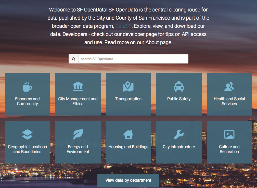
San Francisco’s open data portal has a strong homepage that directs users toward the data they seek and offers useful tools, such as a search function.
A well-designed homepage acts as a simple jumping-off point for users, directing them to the data they are seeking. For example, an open data portal with a strong homepage—like San Francisco’s—displays data categories, a search function, and other useful tools such as the ability to search by government department. Also, the use of accent colors and graphics to differentiate the types of data available can make the site more usable and improve a user’s ability to locate information. Legends that assign a unique graphic and color to each type of data help users identify the files they need quickly and easily.
Data
Tidiness
Data tidiness refers to the format and structure of the data, rather than the content. To illustrate, two data tables may contain exactly the same information, but one may be in a format that is tidy while the other is not. Tidy data simplifies the process of profiling and cleaning the data and is essential to exploratory data analysis and visualization. In the Journal of Statistical Software, Hadley Wickham offers the following three simple criteria that define tidy data:
- Each variable forms a column
- Each observation forms a row
- Each type of observational unit forms a table
The first two criteria are complementary. In tidy data tables, each row represents a distinct “object,” and each column should correspond to some characteristic of that object. Each unique object is an “observation,” and each characteristic a “variable.” Table 1 is in a tidy format. Each row represents a different person (observation), and the columns record various characteristics (variables) of each person such as date of birth, sex, and height. Table 1 is for illustration only, and is not an example from any existing open data portal.
Table 1—Data in a Tidy Format
| Name | Sex | Date of Birth | Height (in) |
|---|---|---|---|
| Person 1 | F | 03/07/1968 | 66 |
| Person 2 | M | 11/05/1971 | 70 |
| Person 3 | M | 07/17/1964 | 68 |
| Person 4 | F | 10/22/1970 | 67 |
Most tidiness errors pertain to the table’s variables. Wickham summarizes three common errors as the following:
- Column headers are values, not variable names
- Multiple variables are stored in one column
- Variables are stored in both rows and columns
In some messy tables, the data values form the columns—one column for males and one for females—rather than having a single column with the variable name as the column header. A tidy format should have one column for the variable, sex, and contain the corresponding value, male or female, in each row. Another common error is to store more than one variable in a single column. In this case, the column headers may convey two values of two variables. For example, if a column contains the range of a set of values, the column should be split into two columns, one for the minimum value and one for the maximum value. Last, variables should never be stored in both rows and columns. Typically, if this occurs, then the top left cell of the table will be empty, though this will not capture all instances of this error.
Data Science for the Public Good (DSPG)
The first six authors—Mark Almanza, Madison Arnsbarger, Jessica Flynn, Emily Stark, Adrienne Rogers, and Will Sandholtz—are undergraduate students and part of the ASA NSF Research Experience for Undergraduate program. Millicent Grant and Samantha Tyner are graduate students in statistics at Iowa State University. The students are part of the Virginia Tech Data Science for the Public Good program.
The Social and Decision Analytics Laboratory (SDAL), part of the Biocomplexity Institute of Virginia Tech, established DSPG to connect aspiring data science scholars to communities that can benefit from their expertise. Students selected through a competitive application process are engaged in a series of hands-on learning experiences while policy makers and government leaders receive data analysis support to inform difficult decisions related to health care, education, and social justice.
The story of each community—its problems, needs, and aspirations—is contained within its data. The DSPG program’s over-arching objective is to equip new generations of scientists with the skills they need to bring this story to light for leaders in local government.
The DSPG program teaches student fellows how to sift through vast amounts of information related to public safety, employment, and the provision of services to discover how communities can become more efficient and sustainable. Through the lenses of statistics, social science, and data science research, DSPG students learn to integrate all available data resources.
DSPG fellows also have opportunities to diversify their expertise and form lasting professional connections by taking part in the Social and Decision Analytics Laboratory’s data-driven research projects. Research teams are horizontally integrated—combining disciplines such as statistics, data science, and the social and behavioral sciences to address complex issues—and vertically integrated—allowing students to collaborate with project stakeholders at all levels.
These unique fellowship experiences are made possible through the support of several research organizations dedicated to serving the public good: American Statistical Association’s NSF Research Experience for Undergraduates (REU); Virginia Tech’s Global Forum for Urban and Regional Resilience (GFURR); and sponsored research.
While it is open for debate whether the responsibility of tidying data is that of the open data portal administrator or the user, tidy data portals may attract more users than portals that require users to tidy the data themselves. Depending on the goal and maturity of the organization supporting the portal, making the data tidy could facilitate better and more frequent use of the content.
Accessibility
Data accessibility is a broad term encompassing the logistics and qualifications of calling a data portal “open.” To assess the openness or accessibility of the data sets, it is important to ask the following three questions:
Data availability can be hindered in many ways. First, for the data portal to be truly open, there must be zero access restrictions and data must be license free. It is important that users have minimal obstacles to accessing the data such as membership requirements, user fees, and data download limits.
Just as restrictions and licenses hinder the openness of data, poor organization and labeling of data sets may hamper full access as well. Data set titles should answer who, what, when, where, and why. For example, the title “Average Housing Costs” answers what information the data set contains, but the title “County Average Housing Costs 2000–2010” also describes who, when, where, and why with only 15 additional characters. In addition to an explanatory title, the most successful open data portals provide brief descriptions of each data set both on the search page and on the data set specific webpage. This information should describe the source of the data set and explain what information the data set contains.
While it is important and exciting to make data public, it is important to ensure the safety of all constituents when uploading data to an open portal. A major safety concern is personally identifiable information (PIIs). In general, it is important to avoid sharing information such as name, social security number, biometric record, or any information that could be used to identify a specific person. PIIs are determined on a case-by-case basis, but inappropriate sharing can lead to legal repercussions. Be sure to understand the localities’ regulations regarding PIIs before sharing data on an open data portal. In general, a unique identifier can be used to anonymize the personal data.
Last, the ability to share data is an essential part of data accessibility. For companies and research groups to use data for innovative apps and studies, the appropriate resources must be sharable. The code for both the website and data sets should be publicly available and an application program interface (API) created. It is important to note that for APIs to be used, the data set must be in a tidy format with appropriate dates and addresses.
Documentation
Proper documentation communicates the credibility of an open data portal by answering questions such as where the data came from and how they were collected. Displaying a list of commissions, agencies, and other government organizations that have made their data publicly available on the site may enhance both the attractiveness and credibility of the portal. In addition, the description of each data set should contain information about the origin of the data.
A well-documented open data portal also provides information about the metadata, or data about the data. A comprehensive data dictionary defining variables from every available data set is an extremely valuable feature. A dictionary that is readily accessible and searchable gives users the ability to find variables contained across many data sets and allows them to compile and cross-reference that information. A feature that provides an explanation of the variable by scrolling over the column header helps facilitate a better understanding of the data set. In addition to defining individual variables, it is also valuable to provide a description of the entire data set.
A final aspect of data documentation is how the data are constructed. File type (e.g., csv, html) is a critical component due to software preference and availability and should be indicated clearly. File names should also be informative, and data sets should contain the raw, unaltered data in a tidy format. If summary statistics such as averages and rates are contained in the data, an explicit description of how those values were calculated should be provided. Last, missing values should be left blank and not represented by characters or expressions. This improves users’ ability to analyze the data, and to understand what information is available to them.
Visualization
Data visualization refers to any presentation of data that is not in table format, such as maps, plots, and charts. An open data portal may incorporate data visualization in various ways. First, portal administrators may provide visualizations to users. These visualizations are typically complex and tell a specific story about the data that the administrators want the public to see. An open data portal also can provide users the tools to create their own visualizations. Tools like these help users explore the data and ultimately make the open data portal more useful. These tools should be clearly labeled, easy to navigate, and not hidden or several clicks away.
Additionally, user experience will be streamlined if the available tools match the level of measurement of the variable. For example, stock price that is measured at the ratio scale can be displayed using line graphs and scatter plots, whereas bar charts are used to display nominal and ordinal scale data.
Finally, the open data portal may provide links to visualizations created by third parties, who create them by accessing the data through the portal and posting them to separate sites. This can increase the use of a portal by attracting people from third party sites. Many data portals only incorporate the first two methods of visualization, while the most sophisticated portals offer all three.
All methods of visualization on an open data portal should follow the same basic guidelines. All visualizations should be easy to interpret with figure titles, axis labels, and legends in legible font sizes. In addition, visualizations should not distort the data view in a way that misrepresents the data. Common mistakes to avoid include starting the y-axis at the minimum data value instead of at zero or another reasonable value and ignoring standard conventions (e.g., reversing order of axes).

This image has added “chartjunk,” extra elements that crowd the view and obscure the data. Here, the “junk” are the people added to the visualization.
Two ways to represent the data accurately are to remove the people icons and make the numbers more prominent or include a legend indicating how many people each person icon represents with the appropriate number of icons in each region.
Good data visualizations may contain many elements, but adding unnecessary content to a figure does not aid in the interpretation of the data and may be misleading. Effective data visualizations contribute to the overall understanding and utility of the data displayed.
While these criteria cover many topics, they are not exhaustive. Currently, most open data portals excel in just a few of the areas outlined above. Site administrators should seek continuous improvement and evolution over time to enhance the user experience. Users are also encouraged to hone their curiosity toward productive applications of open data. Commitment to open data on behalf of site administrators and users alike guarantees a promising and innovative future.
These experiences are made possible through the support of the ASA’s NSF Research Experience for Undergraduates (REU) program.
Further Reading
GovEx. 2016. Open data portal requirements.
Quora. 2016. What are some successful outcomes from hackathons?
Sunlight Foundation. 2016. Open data policy guidelines.
Wickham, Hadley. Tidy data. Journal of Statistical Software 59(10) 2014.


Leave a Reply