
Daniel Smith completed his undergraduate studies at Emory University and earned an MBA with a concentration in statistics at the Georgia Institute of Technology, where he also received his Six Sigma Black Belt training. He has been a reliability engineer at Cox Communications since 2005.
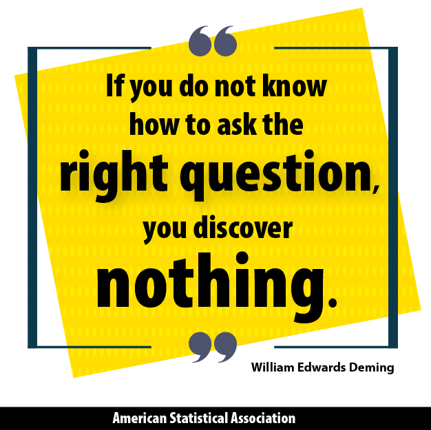
“Imagination is more important than knowledge.”
~ Albert Einstein
Congratulations! You’ve just graduated from college or graduate school after specializing in advanced analytics, received a job offer, and, as your reward, you now get to try to communicate specialized topics to people who have no idea what you’re talking about. Statisticians have little problem communicating with each other, but how do you translate complex ideas to company leaders who specialize in other areas? This can be a problem in any company, regardless of the size.
Fortunately, there are a few tricks of the trade you can employ that make communicating statistical ideas a little less worrisome. Just like a doctor explaining to someone who’s ill what’s happening to their body or an auto mechanic telling you why your car isn’t working, a good statistician can choose several methods to clearly convey what his/her message is.
The quote at the top of this article speaks to that. A company leader may not have a lot of statistical knowledge, but by tapping into their imagination, you can enable them to understand complex mathematical concepts.
A Picture Is Worth 1,000 Words
You could be well versed at discussing terms such as “statistical significance” or “inherent variation,” but company leaders outside the statistics world may still have issues understanding you. This is why putting charts and graphs in front of them makes explaining advanced topics so much easier.
For instance, you may be comparing two processes, and after running the appropriate hypothesis test, you conclude process B is operating more efficiently than process A. If you tell the company leaders that the difference between the two is statistically significant based on the p-value of your hypothesis test, they may be confused. However, what if you show them a chart of confidence intervals for the key process indicators and explain that you are guaranteeing with 95% certainty that their true process average lies within these ranges? When they see the intervals do not overlap, they will intuitively understand the statistical significance, even if they cannot formally define statistical significance.
Box plots often work as well as confidence intervals, but I prefer using box plots for skewed data so the outliers are easy to spot. Before-and-after process snapshots using histograms are also visually effective. If you can demonstrate the entire distribution has shifted, then improvements in process averages are less likely due to an extreme outlier and more likely due to overall process improvement.
Be Overly Analytical
When discussing advanced topics, people tend to jump to conclusions based on your data because they see the next step as logical. This can have drastic implications if you don’t take the time to explain to them what the data are saying, and often times more importantly, what the data are not saying. This generally occurs in situations in which we fail to reject our null hypothesis.
In the aforementioned example, let’s say you find no statistically significant differences after comparing processes A and B. If you explain to your boss that we should not reject process A in favor of process B, your boss may conclude that process A is better than process B. In reality, you have not proven that. All you have proven is that we should not reject process A in favor of process B. The possibility that the two processes are equal still exists (See “Mathematical Myopia: Debunking Common Six Sigma Misconceptions.” Without being overly analytical, simple mistakes like this can become routine as people outside the world of statistics infer what they believe as the logical conclusion. It’s your responsibility to keep that from happening.
Let the Data Speak
Often, people see what they want to see in analysis results with regard to a preconceived agenda. Many times, this will be tied to a past or future financial investment, seeking to either justify spending or defend it thru analytical leaps the data doesn’t necessarily support. When this occurs, it is important to keep the interpretation of your results on point. After all, you’re not trying to make the data look good or bad. The data should be interpreted in the way that most accurately depicts what the true story is.
This also can become a situation in which how you say something may be more important than what you say. For example, if someone in a leadership role completely misinterprets a recent analysis you have completed and you let them know how badly they misconstrued your information, they may feel insulted and less inclined to hear your main point. However, if you acknowledge their perception and explain why it’s slightly off point, they may be more willing to keep an open mind. Remember, you are the expert and it is your job to make sure your analysis results are understood correctly. Don’t let someone else’s agenda dictate the way your data are perceived.
I don’t want to completely discount the countless other influences that can affect how your message is perceived, some of which may be outside your immediate control (e.g., company politics, public speaking, open-mindedness of your company’s leaders, etc.). However, focusing on the points mentioned above should aid you greatly in your quest to translate complex messages into easy-to-understand terms.

“…if you show them a chart of confidence intervals for the key process indicators and explain that you are guaranteeing with 95% certainty that their true process average lies within these ranges?”
You better make sure that you construct simultaneous confidence intervals, otherwise you inflate the Type I error rate and your guaranteed 95% is really only a guaranteed 80% or even worse.